User research revealed that many first-time users were unsure how to pair their NFC nails or understand what happened after tapping them. This confusion often caused drop off before profile creation. I mapped a new user journey that simplified the onboarding process, added guided feedback during connection, and clarified next steps with visual cues. The redesigned prioritizes helping users understand their progress and stay engaged through rewards and community features.
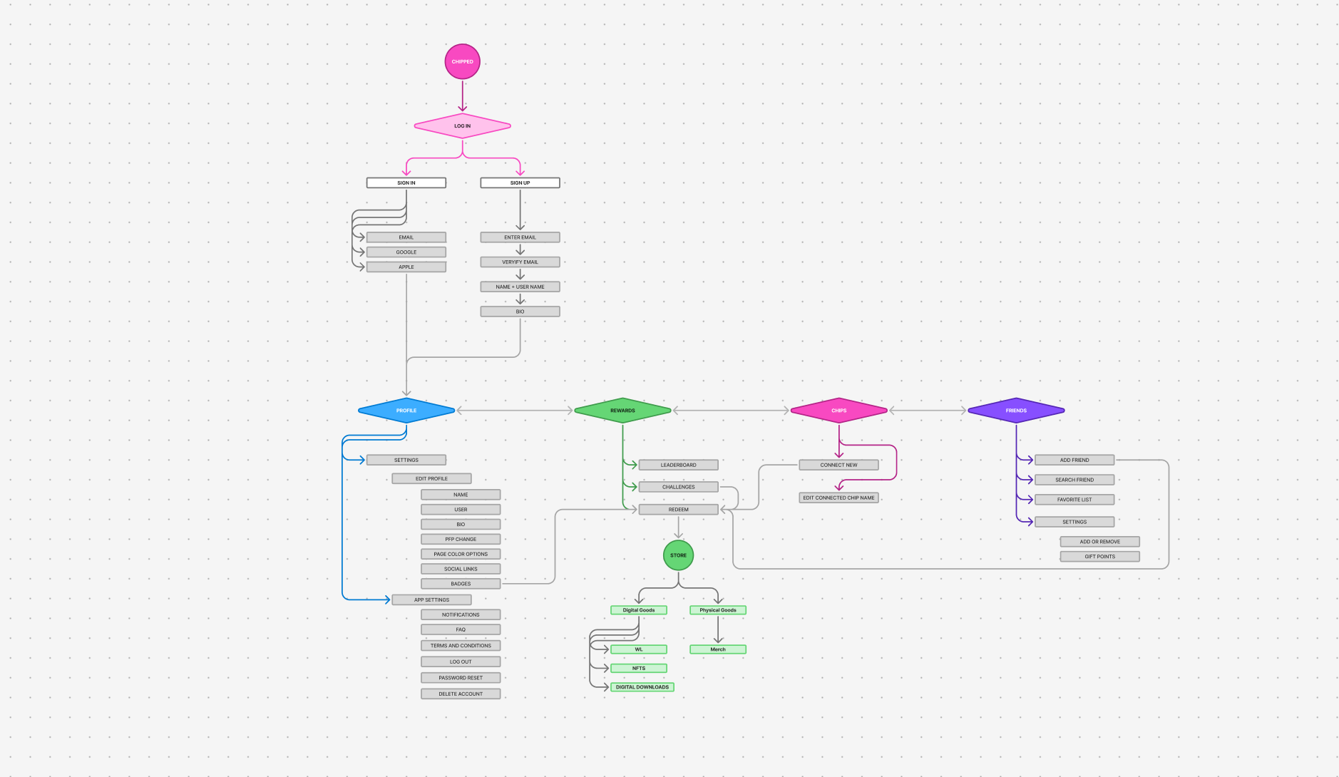
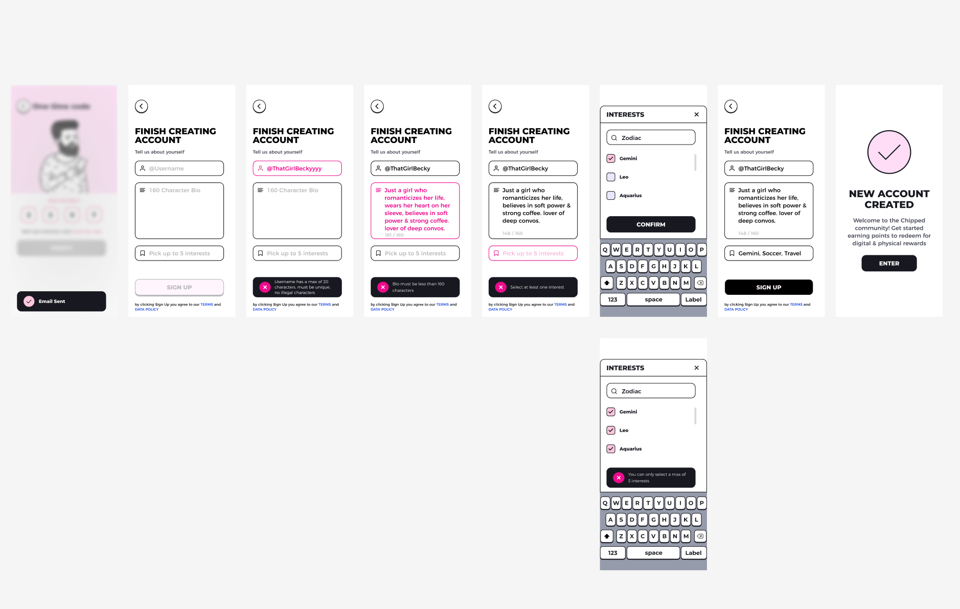
I designed a lightweight onboarding sequence that guides first-time users through creating an account, verifying identity, and setting core preferences. The flow prioritizes clarity, progressive disclosure, and robust error states so users can recover quickly without losing context. The outcome was fewer drop-offs, faster time-to-first-action, and a consistent foundation for future features.
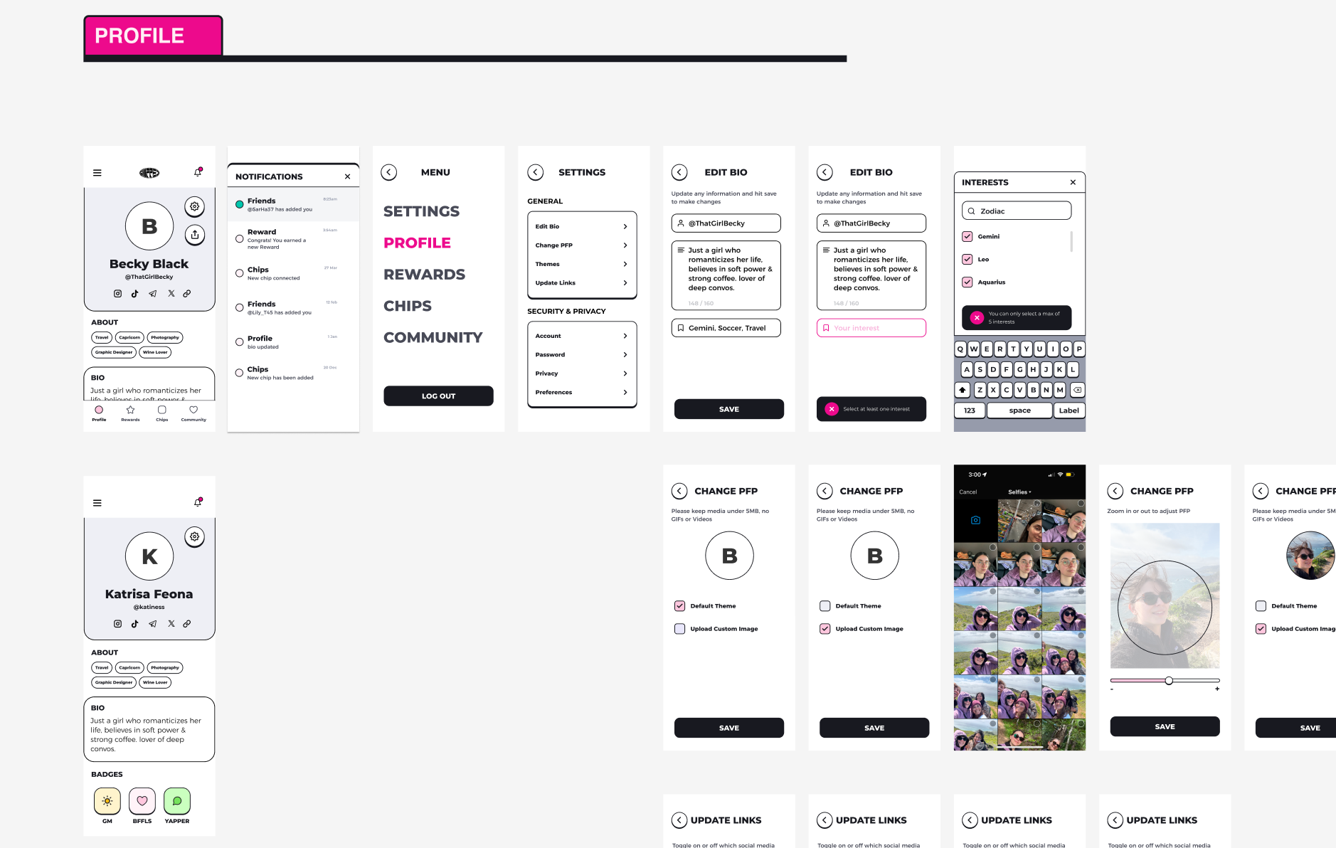
The profile setup and settings screen gives users full control over their experience, from customizing their profile and selecting interests to managing rewards, linked accounts, and privacy preferences. It organizes multiple layers of user data into an intuitive, scrollable layout with consistent iconography and navigation. Overall it makes it easy for users to identify where to navigate and update information without friction.
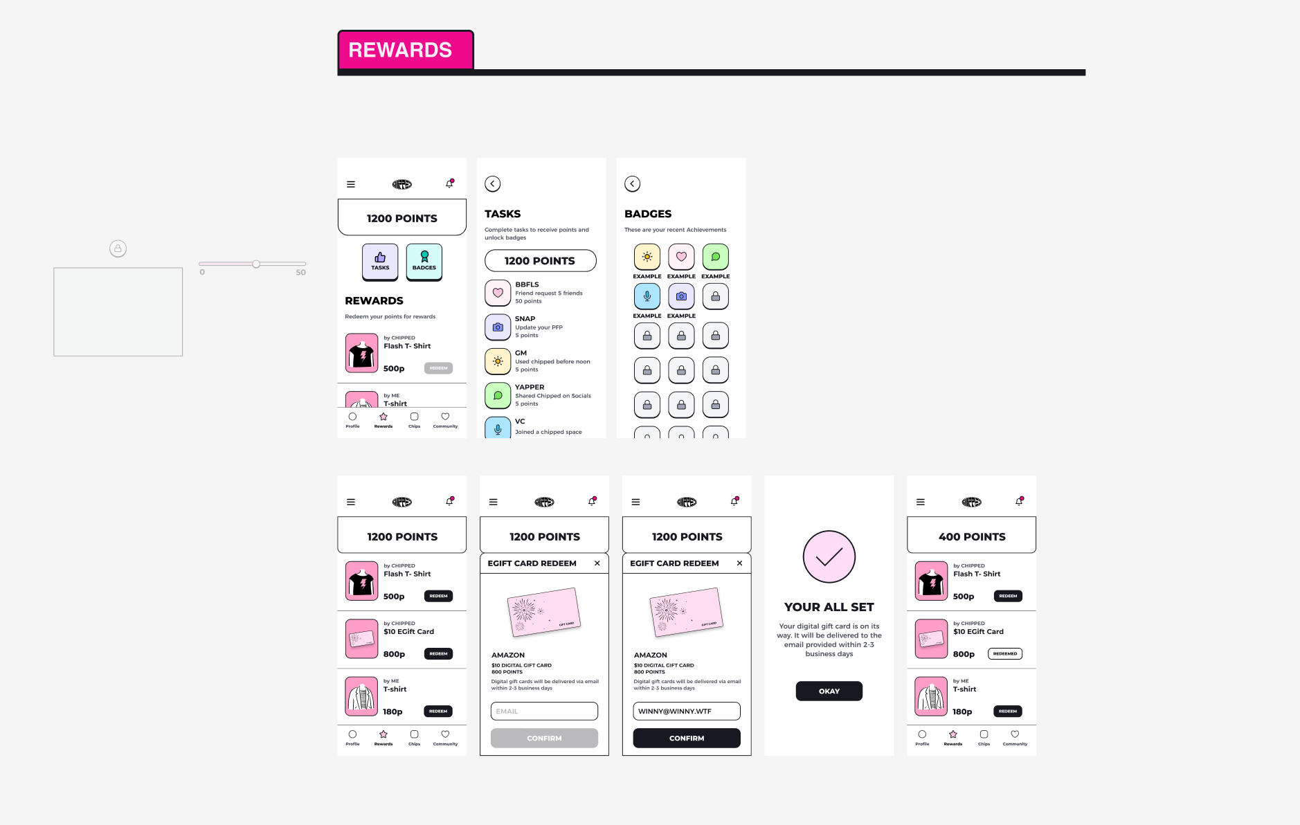
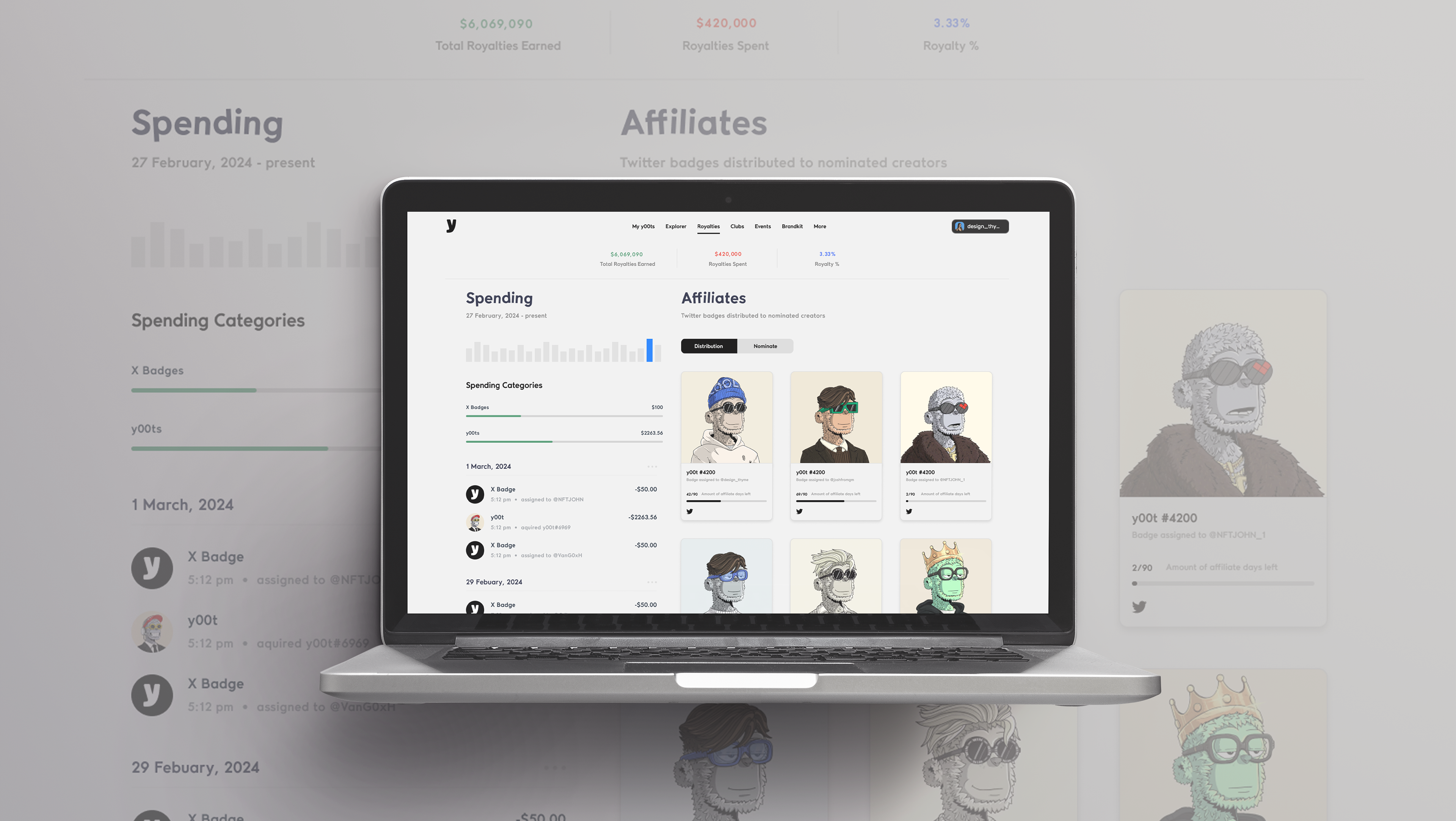
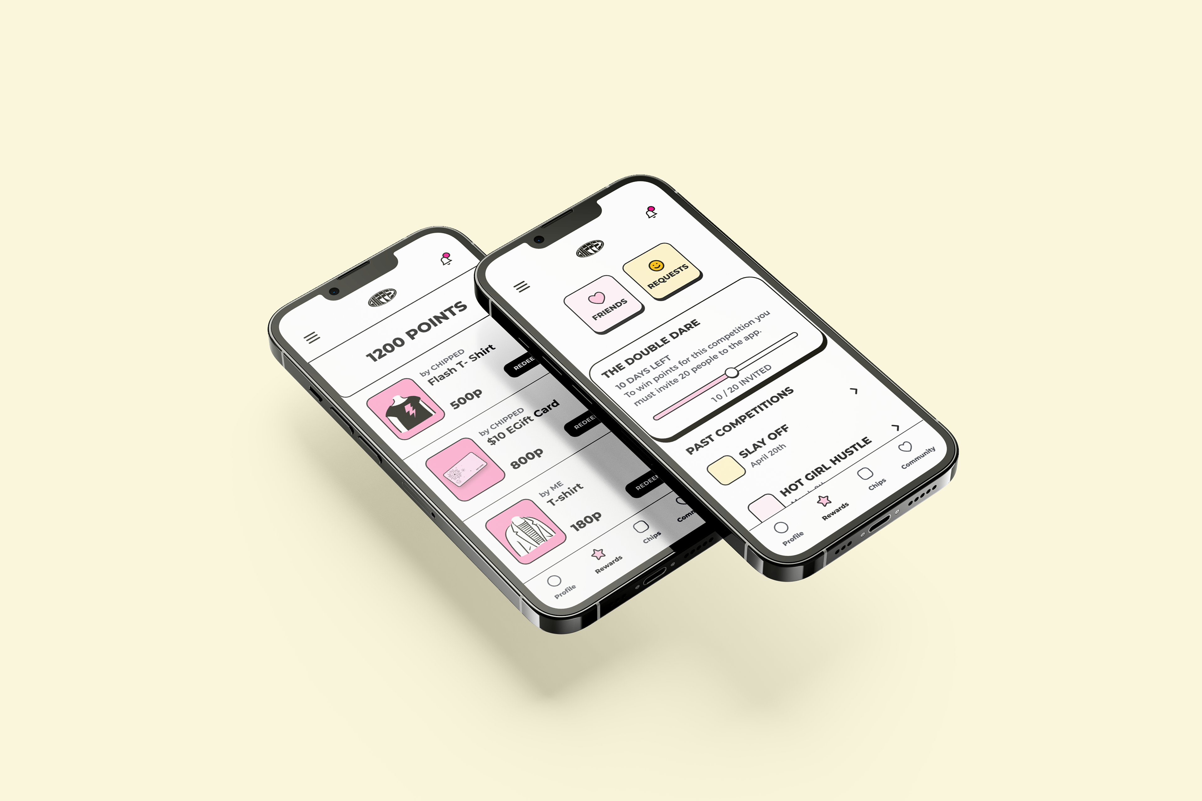
The rewards screen centralizes points, badges, and redeemable offers, turning engagement into a gamified experience. The layout was designed to make progress feel tangible. Users can easily track their earned points, view upcoming reward tiers, and access available redemptions through clear visual hierarchy and consistent spacing. Color and iconography were intentionally used to convey a sense of reward and progression, while maintaining brand cohesion across the interface. From a UX standpoint, by grouping related actions and offering contextual tooltips for clarity the cognitive load is lightened. The result is a system that reinforces positive behavior and strengthens long term engagement with the platform.
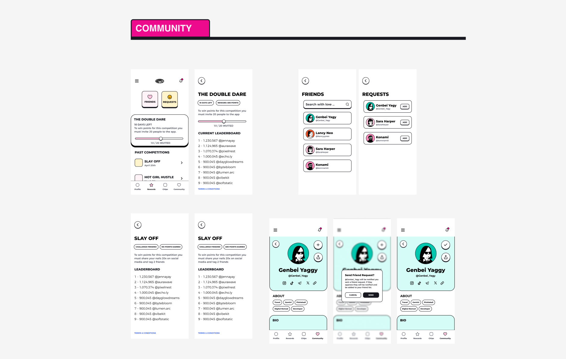
The Community Center brings together all engagement incentives in one accessible hub with tasks, rewards, badges, and a leaderboard. Each section is designed with clear hierarchy and consistent visuals, making it easy for users to understand their progress and achievements. Tasks show completion status and progress bars, rewards are categorized by type, badges highlight milestones, and the leaderboard adds friendly competition. The design focuses on maintaining clarity and motivation through balanced color, spacing, creating a satisfying and goal-driven user experience.
This redesign established a scalable visual system and improved overall app usability, setting a strong foundation for future product and community growth. Through this project, I learned the value physical product interactions with intuitive digital feedback, especially in emerging tech experiences like NFC chips. By focusing on user clarity, the process reinforced the value of systems thinking, design consistency, and creating functional yet engaging product experience.